
Currency Convertible
What Is It?
A platform that allows users to research live currency exchange rates from any denomination and convert any currency for another instantly. Prototyped for mobile and desktop experiences.
I designed this product while completing the Google UX Design course.
Date: Feb - in Progress
Project Owner: Allen Minecci
Created With: Figma
...the problem.
A traveler needs to easily research, convert, and store currencies from a variety of different countries.
Competitive Audit
While this type of product/experience is not novel, I wanted to make a refreshingly well-made product that could potentially win over the users, some of whom are already successfully using a different product to solve their problem (stated above). It became very important to discover what the gaps in the market were and capitalize on them.
Live products I explored to understand this specific market:
-
My Currency Converter & Rates – Direct competitor, with the same product and the same target audience as my currency exchange app
-
Currency Converter – Direct Competitor, with the same product and the same target audience as my currency exchange app
-
Sightseeing Pass Travel Guide – Indirect Competitor, with a different product and the same target audience as my currency exchange app
-
MigApp – Indirect Competitor, with a different product and the same target audience as my currency exchange app
Competitor's Strengths
-
Simple
-
Clean
-
Ability to update without an internet connection
Competitor's Weaknesses
-
Poorly designed UI / Poor brand quality
-
Limited features
-
Limited accessibility
Opportunities
-
High-level brand awareness/High-quality brand and design
-
Creating a higher sense of security
-
Introducing helpful information for travelers that is still related to money and finances/security.
-
Better navigation,
-
More features yet maintain simplicity.
Based on my research, I found 3 main user types for whom my product will solve the problem stated earlier. The most common pain points around converting currencies include: lack of convenience, exorbitant fees, and insecurity with the platform. These personas helped me empathize with a few types of users who will likely be using my app. I can picture all. of these personas having a frustrating experience converting currency in the past.
The takeaway: While the users have different frustrations and needs, they will all be more likely to enjoy and find value in an experience that is easy to use, always available, branded, trustworthy, and elegant. These attributes also align with the main gaps I found from my competition research.


User Personas
Goal Statement
My global finance app will let users easily and securely compare and convert different currencies. It will allow international travelers to convert and monitor their money at all times, It will also ensure they always get the best rate possible. I will measure effectiveness by the amount of conversions that are made monthly and retention rates compared to download rates.
Design
My intention for the Interface design and branding for the project is: clean, trustworthy, universal. I wanted to make a design that was pleasurable to use and inviting for users of all cultures and countries. As stated previously, It is important to give the user a sense of trust to earn their loyalty and improve retention rates. Through my competitive audit, I realized there was an opportunity to win over the market with a design that is simple to use, trustworthy, and an additional focus on smooth user flow through intuitive navigation and gestures.

A big picture storyboard was created to capture the setting and environment when a user may be using the app.

Close up storyboard was created to relate with the immediate goals of the user while completing the primary task of the app.

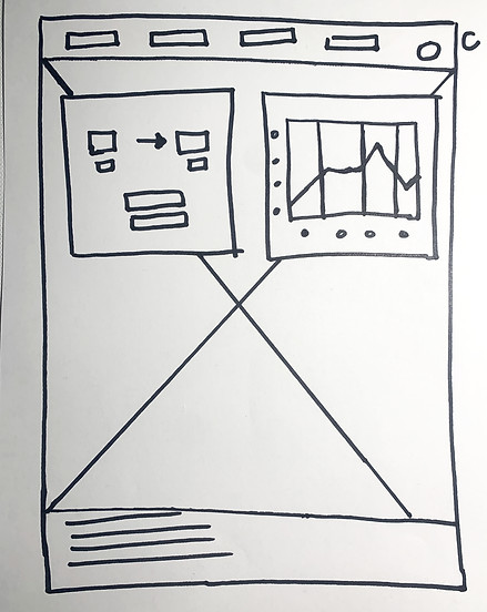
Early wireframes got the MVP functions organized on separate screens


After user testing, I received some key insights for the user flow.
the navigation was confusing - the conversion action quickly accepts the conversion without requesting confirmation - the graph is hard to read/understand


Having one focal color to establish a strong emotional connection and neutral secondary tones promotes a professional and secure aethetic.


The gestures and animations were chosen to help the user feel more acclimated while completing all tasks. The main pages navigate side to side while the wallet and favorites swipe up and down.
The wallet and favorites overlays can be dismissed by swiping or clicking off the overlay. Users are able to interact with the app in whatever way is most natural to them.
Branded colors and simpler meter controls make the graph more accessible.
High-Fidelity Prototypes


The welcome screen plays a vital role in shaping first impressions. This hero graphic, is complimented by the multi-language welcome message to promote a sense of global union.
during interviews users noted that the absence of a confirmation screen was jarring. A confirmation screen has now been added. The "Favorites" and "Wallet" features allow the user to feel secure about their transactions.
Users can dismiss these overlays by either swiping them down or tapping outside the overlay.
Subtle design decisions were inspired by wallets and credit cards.
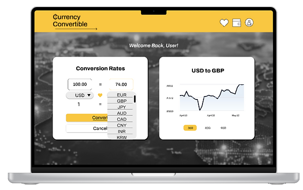
Desktop Experience
The desktop experience for Currency Convertible is designed to compliment the mobile application. The features are the same, and their are no new features or facets to complicate the tool for the user but instead carry over the functions and branding aesthetic so users can use the function seamlessly from any of their devices.
Site Map

Wireframes


User Feedback
Insights can be found from sources who have some distance from the project. My eyes catch many design opportunities. But I missed a few easy fixes to make the experience more successful and accessible. The next round of iterations was aimed at making the app more legible, cleaner, and tighter.
"I like the yellow element it looks like light and symbolizes transfer. But you should keep in mind that white writing on yellow is not easy to read. A little more space between the data also makes it clearer."
- Prototype User #1


Updates:
Standardized button format
More contrasting color combinations - WCAC compliance
Spacing increase between elements


Reflections
I am proud of the branding and UI design of the app. This app could be competitive in the market of currency converter apps based on the design alone. I think there is a strong potential for building a loyal user base.
I would have liked to get even more feedback and more controlled and monitored user testing opportunities to be able to iterate further with more data. If I were to push this product into the market, I would invest in user testing and at least one more iteration before going live.

See Another
UX Case Study!